Ebasnet has a new functionality to distribute the widgets of your page in a simpler and more intuitive way. We tell you how!
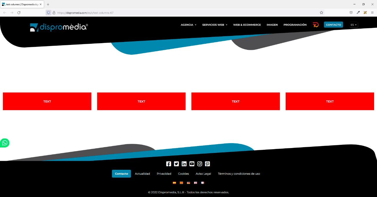
Until now Ebasnet automatically defined the space of each widget in columns, and it could only be customized if you specified it by code. For example, until now, if we placed 4 widgets in a container, the manager already distributed the space of each one proportionally, that is, if the container has a size of 100%, in this case each widget corresponds to 25%. of the whole space.
As shown in the following image:
With this new functionality, you can define yourself the space you want each widget to have. You can modify it within the edit widget – columns tab.
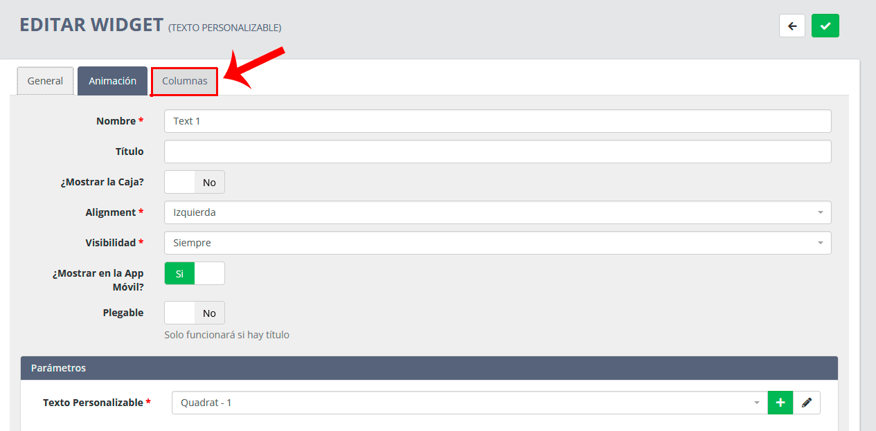
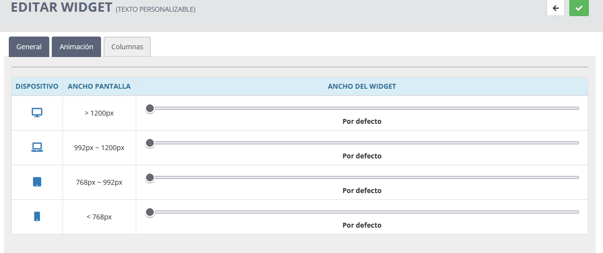
In this section you can specify how much space you want each widget to have (remember that if you modify a widget you must do it in all the widgets of the same container).
We show you an example!
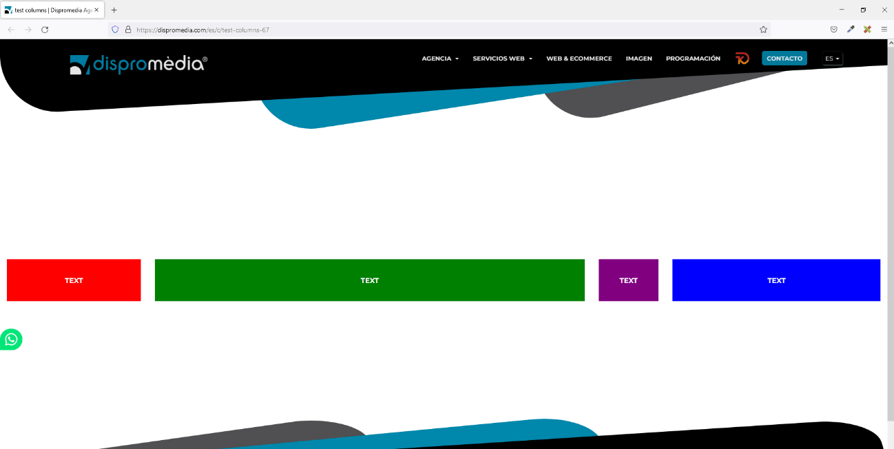
In the following image we have distributed four "customizable text" widgets so that each one occupies a different space.
Red box:
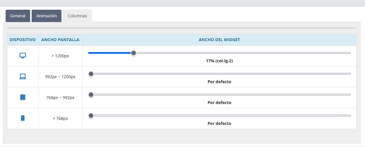
Green box:
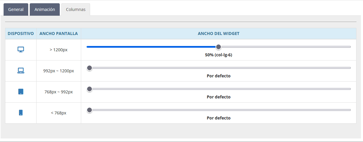
Purple box:
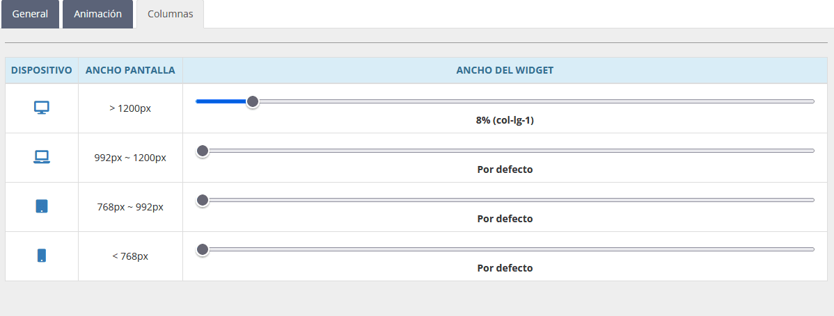
Blue box:
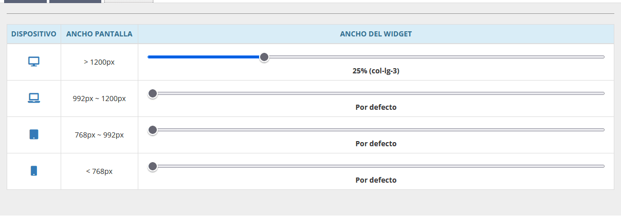
As you can see, we've given each widget in the container the space we wanted.
The total sum of the percentages does not have to exceed 100%, since if it exceeds it, the widget would jump down as it does not have space. On the other hand, if we count it by columns, the total sum of the columns will not have to be greater than 12, since the widget would jump down because it has no space.
In this example we have specified the following values:
| RED | GREEN | PURPLE | BLUE |
| 17% | 50% | 8% | 25% |
| col-lg - 2 | col-lg - 6 | col-lg - 1 | col-lg - 3 |

